

Signposting likely Medicaid eligibility without muddling the message

The Missouri Medicaid expansion -- mandated by referendum, denied funding by the state legislature, and enacted only after the Missouri Supreme Court so ordered -- is off to a slow start, with the administration of Republican Governor Mike Parson declining to do much outreach. Enrollment of those rendered newly eligible by ACA expansion criteria began on October 1.
News of the slow start led me to check whether HealthCare.gov has been retooled to tell Missouri visitors who use the site's see plans and prices tool that they're likely eligible for Medicaid if they input an income below the eligibility threshold. HealthCare.gov is not the primary means by which people enroll in Medicaid, but it's a "no wrong door" channel.
Yes, HealthCare.gov has has been updated. That's not surprising -- it's had to absorb about a dozen late Medicaid expansions. But the check underscored to me that messaging on the site for those likely eligible for Medicaid (in all expansion states) could be clearer.
Here's what you see if you input an income below the eligibility threshold (here, $17,000 for a solo applicant in zip code 63111 in St. Louis):

This could be worse: the app does tell you that you may be eligible for Medicaid (it would be nice if the technology could cut out CHIP when no children's ages are input, but let's not be fussy...) and invite you to learn more.
But there's a fair amount of visual and grammatical interference here. The messaging presumes that the user has a grasp of the difference between "plans" and "Medicaid or CHIP." The messaging about "plans" (unsubsidized!) takes up more space and arguably commands more visual attention than the information about Medicaid and CHIP. The pronoun "they" in "They won't be covered" doesn't have a clear antecedent, and doesn't "agree with" a solo antecedent, unless she's blessed with gender sensitivity with regard to pronouns.
Contrast the messaging and visual display for a likely Medicaid-eligible visitor to HealthSherpa, the dominant commercial Direct Enrollment platform:
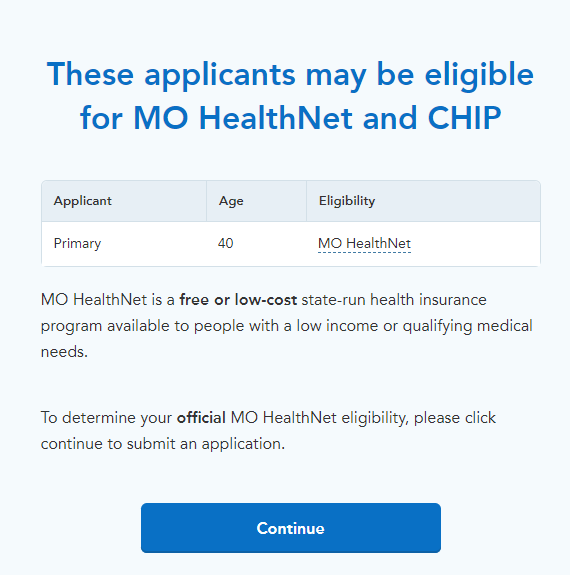
Two features stand out:
1) There is no mention of marketplace plans, since the prospective enrollee does not qualify for a subsidy (if he entered his income correctly)
2) There is a very large "continue" button. HealthCare.gov, in contrast, invites the user only to "learn more about Medicaid and CHIP," without so much as an invitation to start an application.
Less important but also helpful: the page refers to the name of the state Medicaid program, MO HealthNet, rather than "Medicaid." The latter carries a stigma to many ears -- and for that very reason, many states brand their Medicaid programs with different names.
HealthCare.gov has come a long way since its launch in fall 2013. It's got a clearer interface and is easier to use than most state-based exchanges. But HealthSherpa, which accounted for 23% of HealthCare.gov enrollment (via the Direct Enrollment interface, and mostly through brokers) in 2021, has continued to hone a more streamlined, better-signposted interface.
P.S. Even more importantly, in states that have refused to expand Medicaid and so have a "coverage gap" (offer no help) to applicants with incomes below the poverty line, HealthSherpa tells shopper how high their income needs to be to qualify for marketplace subsidies ($12,880 for an individual) - - and HealthCare.gov doesn't.